Design Summary
Features used
-
Font Awesome
This is used to add icons to the website
-
Javascript
This was used in the slider in the contact form for styling purposes
-
Bootstrap
This was used to style some elements in this page. Though it was not used in the other parts of the website.
I decided to write all css in the website by myself in order to learn. -
JQuery
This was used on the preloader. This basically displays a loading screen until all items on the page have been loaded fully.
Also, it was used in the cart to delete items when requested by the users
Design Choices
This site has a main theme of white and black with a hint of red and
blue.
The site is an example of an e-commerce website that only sells shoes
for men and women.
-
Cart
The cart was designed in a way for the users to see the totals and their selected items side by side in order for easy checkouts
Navbar
The navbar was designed for easy navigation to the webpages
Shopping pages
The pages that show items were designed for easy viewing.
They adjust to the screen sizes by wrapping their contents.About page
This page was designed to tell the user the most important aspects of the organization (Downy)
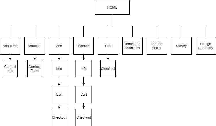
SiteMap
